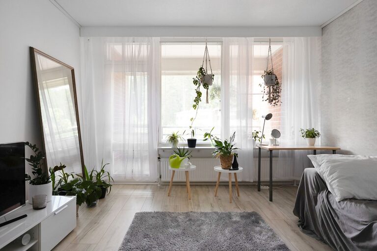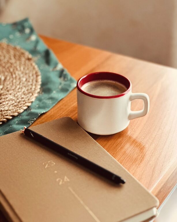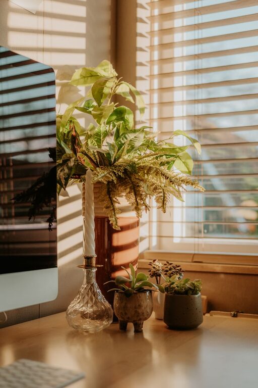
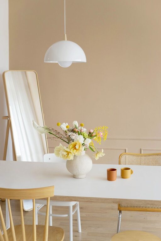
Choosing calm colors for your home can make each room feel more comfortable, balanced, and inviting. Soft colors can help create a relaxing atmosphere, while carefully chosen deeper shades can add warmth and character without making a space feel busy.
The best color palette depends on your room’s natural light, size, furniture, and purpose. With a few simple guidelines, you can create a peaceful look that feels personal and practical.
Start With the Mood You Want
Before choosing paint or accessories, think about how you want the room to feel. Color can influence the overall impression of a space, even when the changes are subtle.
For a calm home, you may want a room to feel:
– Light and airy
– Warm and welcoming
– Quiet and restful
– Natural and grounded
– Clean and organized
A bedroom may benefit from soft, restful shades, while a living room may feel better with warm neutrals and gentle earthy colors. A home office might use muted blue or green to create a focused setting without appearing cold.
Defining the desired mood first will help you avoid choosing colors simply because they are popular.
Explore Soft Neutrals
Soft neutrals are a reliable foundation for a calm color scheme. They are easy to combine with furniture, textiles, and decorative items, and they can make a room feel more open.
Common calm neutrals include:
– Warm white
– Cream
– Beige
– Soft gray
– Taupe
– Light greige
Warm whites and creams can make a room feel cozy, especially when paired with natural wood. Soft gray can create a clean and modern look, while taupe and greige offer a balance between gray and beige.
When selecting a neutral, pay attention to its undertone. Some whites and grays have blue undertones, which can make them feel cooler. Others have yellow, red, or brown undertones, which may create a warmer appearance. Comparing samples next to your floors, furniture, and trim can help you see these differences.
Consider Gentle Blues and Greens
Muted blues and greens are often associated with nature, water, and open spaces. They can bring a sense of calm without making a room feel plain.
Pale blue can work well in bedrooms, bathrooms, and rooms with plenty of natural light. Dusty blue and blue-gray are more subdued choices that can add color while maintaining a quiet appearance.
Soft green shades, such as sage, eucalyptus, and muted olive, can create a natural and restful feeling. These colors work especially well with wood, woven materials, white fabrics, and indoor plants.
When choosing blue or green, avoid shades that are extremely bright or heavily saturated if your goal is a calm look. A color with a slightly muted quality is usually easier to live with and combine with other elements.
Use Warm Earth Tones Carefully
Earth tones can add comfort and depth to a calm home. Shades such as sand, clay, mushroom, and muted terracotta bring warmth while still feeling natural.
These colors are particularly useful in living rooms, dining areas, and entryways. A soft clay wall can create a welcoming background, while terracotta accessories can add small touches of warmth to a neutral space.
Because some earth tones are visually strong, consider using them as accent colors rather than covering every wall. You might add them through:
– Throw pillows
– Curtains
– Area rugs
– Ceramic pieces
– Artwork
– Small pieces of furniture
Pairing earth tones with soft white, pale beige, or muted green can help keep the overall look balanced.
Pay Attention to Natural Light
Natural light can change how a color looks throughout the day. A shade that appears soft in the morning may look warmer or darker in the evening.
Consider the direction of your windows:
– North-facing rooms often receive cooler, softer light. Warm neutrals, creamy whites, and gentle beige can help add balance.
– South-facing rooms usually receive stronger light. Cooler grays, soft blues, and muted greens may feel comfortable here.
– East-facing rooms get warm morning light but cooler light later. Balanced neutrals can work well.
– West-facing rooms may appear cooler in the morning and warmer in the afternoon. Choose samples that look good at different times of day.
If a room receives little natural light, very cool colors may make it feel less welcoming. A warm neutral or gentle earthy shade may create a more comfortable result.
Test Colors Before Committing
Paint chips are useful, but they do not always show how a color will look on a full wall. Before making a final decision, test your preferred shades in the actual room.
Paint large sample boards or sections of poster board and place them near different walls. Observe them:
– In bright daylight
– On cloudy days
– Under lamps
– Beside furniture
– Near flooring and trim
Move the samples around the room because light can vary from one wall to another. Look at them for at least a day or two before deciding. This gives you time to notice changes in tone and how the colors affect the room’s atmosphere.
Testing also helps you compare similar shades. Two colors that look nearly identical on a small card may appear noticeably different when placed side by side.
Build a Simple Color Palette
A calm room does not need to use only one color. The key is to create a limited palette with enough variation to add interest.
A simple approach is to choose:
- One main color for walls or large surfaces
- One supporting color for furniture or textiles
- One accent color for small decorative details
For example, you might combine warm white walls, pale wood furniture, and muted sage accessories. Another option could be soft gray walls, cream textiles, and dusty blue accents.
Using different shades of the same color can also create a peaceful effect. This approach, known as a tonal palette, might include pale beige, medium taupe, and deeper brown. Similar colors help the room feel connected without appearing repetitive.
Balance Light and Dark Shades
A calm color scheme can include darker shades, but use them thoughtfully. Deep colors such as charcoal, forest green, navy, and warm brown can add depth and make a room feel more grounded.
To keep the space from feeling heavy, balance dark elements with lighter surfaces. For example, a deep green accent wall may work well with light bedding, pale flooring, and simple white curtains.
You can also introduce darker colors in smaller amounts through:
– Picture frames
– Lamp bases
– Cabinet hardware
– Cushions
– Side tables
– Decorative objects
A common way to create balance is to use mostly light colors, a smaller amount of medium shades, and just a few dark accents.
Coordinate With Existing Features
Your walls are only one part of the room. Flooring, cabinets, countertops, furniture, and window treatments all affect how a color will look.
If your home has warm wood floors, a creamy white or soft beige may coordinate better than a cool blue-gray. If your furniture is mostly white or gray, muted green, blue, or natural tan can add warmth and interest.
Do not feel that everything must match exactly. Instead, look for colors that share a similar level of warmth or softness. A balanced combination often feels more natural than a perfectly matched one.
Keep Calm Colors Personal
The most important rule is to choose colors that you enjoy seeing every day. A peaceful home should reflect your preferences, not just design trends.
If you love color, you do not have to limit yourself to white or beige. Choose softened versions of your favorite shades, and use brighter colors in smaller details. If you prefer a simple look, a layered neutral palette can still feel rich through different textures and materials.
Start with one room, test several samples, and make changes gradually. By considering mood, light, existing features, and color balance, you can create a home that feels calm, comfortable, and welcoming.
About the Author